Gnuplot for the Plotless
2025-07-12 | 2025-07-22
Estimated Reading Time: 36 minutes
Context
Gnuplot1 is
the granddaddy of standalone plotting programs. It has been around since
1986. It is an open-source, no-charge, copyrighted plotting program
suite that is platform-agnostic and blazingly fast. It can handle plots
of functions and data in both two and three dimensions and has evolved
into a very powerful tool for scientific analysis and research.
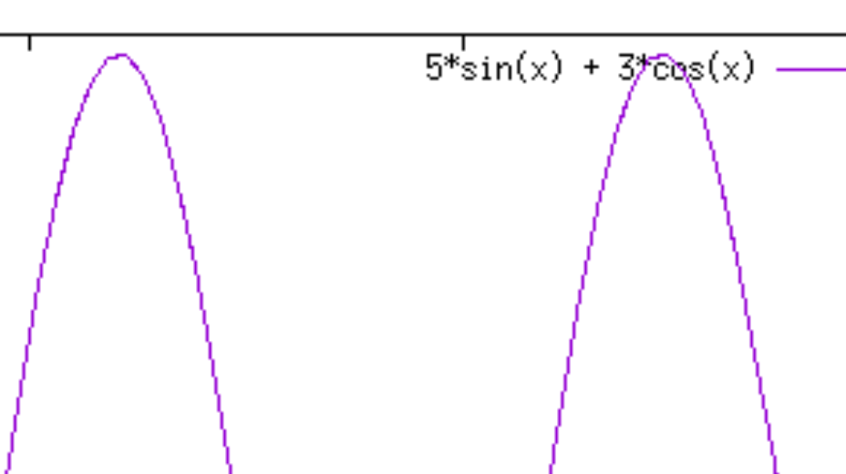
I first used it in the early 1990s when its performance matched the expectations of the day. In that period, “bitty” fonts like those from a dot-matrix printer, and “staircase-curves” were the norm. For example, the gnuplot output from those days would have typically looked like Figure 1 and Figure 2, when magnified.
But graphics and printing have come a long way since then. Today, we have vector graphics that do not suffer from the drawbacks of rasterization or screen resolution. And we use fonts that can be zoomed into with perfect rendering. The pixellation of the past has been purged.
Contemporary graphics programs, developed more recently, do not carry the baggage of the past. They provide excellent on-screen graphics that will match in fidelity the output from a laser printer. The suite of programs that I have been using recently include TikZ-PGF in conjunction with LaTeX, Matplotlib, and the newcomer on the block, CeTZ-plot with Typst.
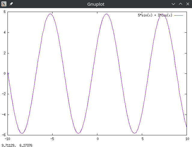
While I was writing my last blog, e Unleashed, I needed to plot a family of catenaries, shown in Figure 3 of that blog. I used the CeTZ-plot/Typst combination and got an output that was decent enough for my purpose.
Then, on a lark, I wondered what the output would be like if I had
used gnuplot instead. And, boy, was I in for a surprise. Gnuplot has
stayed true to its origins in an earlier era. Its syntax is crisp and
laconic. It still calls its output devices terminals. But
the graphics that comes out can match the best that the newer graphics
programs put out. In fact, these later programs betray their origins in
the design, classification, and nomenclature used by gnuplot. If you are
impatient, Figure 11 is gnuplot’s
equivalent for Figure
3 in e Unleashed.
And gnuplot’s secret lies in its terminals. I was able
to give you a taste of the pixellated outputs of the 1990s because such
a terminal is still supported by gnuplot. But also supported are newer
formats like PDF and SVG, through their own specific terminals. With
these terminals, and using substantially the same syntax for the innards
as before, we can get output from gnuplot that can give the newer
plotting programs a run for their money. In fact, gnuplot, being
interactive, might prove to be more productive in the long run.
Purpose
I was impressed with the current incarnation of gnuplot. But I was clueless about how to use it effectively. This blog arose from many questions to myself—questions to which answers were difficult to find. I hope it helps some of you who might be contemplating using gnuplot, but are deterred by not knowing how or where to start, and having started, are floundering at the deep end about absurdly simple issues like how to plot straight lines.
Where can I find help?
My first reaction upon resuming use of gnuplot was a sense of helplessness. It felt like being thrown in at the deep end of the pool. Where do I look for help? How do I start? How do I use gnuplot’s interactive mode to my advantage? How do I get rid of those pixellated terminals and move to something that gives vector graphics? Is there a forum where I can ask questions?
The questions were too many and they flew willy nilly in my mind like a flock of unruly birds. Let me start answering some of these questions.
The best places to start
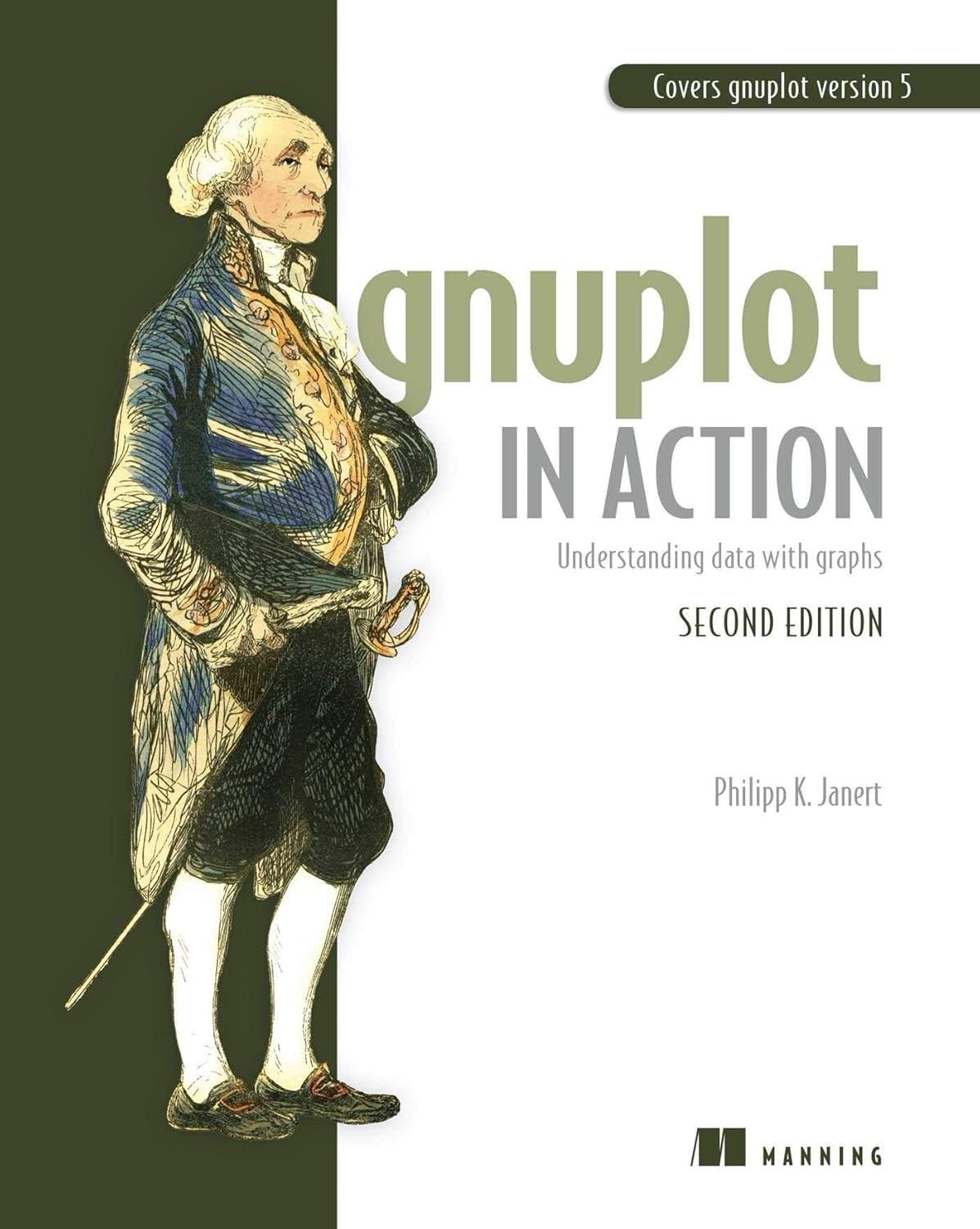
I have found, after much searching and questioning, that the best place to start is by reading the book Gnuplot in Action by Philipp Janert [1]. The cover of this book is shown in Figure 3 below.
Another excellent book to keep by your side when using gnuplot is
Gnuplot 5 by Lee Phillips [2]. Although we are now at
gnuplot Version 6.0 patchlevel 3 and book’s title says
Gnuplot 5, that does not matter. Gnuplot 6 is so new that
there are no books on it yet, and both the books recommended here refer
to some incarnation of Gnuplot 5. This book has been graciously made freely downloadable by
the author.

The USP (Unique Selling Point) of the book by Phillips is that it is chockablock with examples that give ready-made solutions to a myriad of puzzling scenarios. It will therefore be an invaluable time-saving aid to the harried student or researcher who is short of time, and simply wants to get the job done first, before learning gnuplot well.
Investing in these books would be a good decision. It will help you avoid much wasted time and effort seeking help helter skelter.
Gnuplot Home Page
The Gnuplot Homepage is a complete
resource for gnuplot. There is a demo gallery, online documentation, and
a downloadable user manual in PDF. If you are willing to take the time
to search and learn, you will be richly rewarded. If you are in a hurry,
consult the help oracle outlined below.
Gnuplot in interactive mode:
help
Gnuplot is run interactively every time gnuplot is typed
on a terminal. In this sense it is a REPL
language like Python or Julia. Also, like them, it can execute stored
scripts.
When run interactively, gnuplot’s help can act like an
oracle, answering questions about itself, within its own limits.
help output
Suppose you wanted to know how to save a graphic that came up
interactively, what would you do? You could type
help output.2 When I type help output
on my terminal, this is what I get:
gnuplot> help output
 Syntax:
       set output {"<filename>"}
       unset output
       show output

 Graphs produced by non-interactive terminals are by default sent to `stdout`.
 The `set output` command redirects output to the specified file or device.
 The file opened by this command remains open until a subsequent set/unset
 output command, a change in terminal type, or exit from gnuplot.

 Interactive terminals ignore `set output`.

 The filename must be enclosed in quotes.  If the filename is omitted, the
 command is equivalent to `unset output`; any output file opened by a previous
 `set output` will be closed and new output will be sent to `stdout`.

 When both `set terminal` and `set output` are used together, it is safest to
 give `set terminal` first, because some terminals set a flag which is needed
 in some operating systems.  This would be the case, for example, if the
 operating system needs a separate open command for binary files.

 On platforms that support pipes, it may be useful to pipe terminal output.
 For instance,

       set output "|lpr -Plaser filename"
       set term png; set output "|display png:-"

 On MSDOS machines, `set output "PRN"` directs output to the default printer.

Subtopics available for output:
    file

Subtopic of output:
help test
But suppose you wanted to know how to make the graph of one function
a solid line and another, a dotted line? What you need is
test whose results are worth saving in a PDF or other file
for future reference.
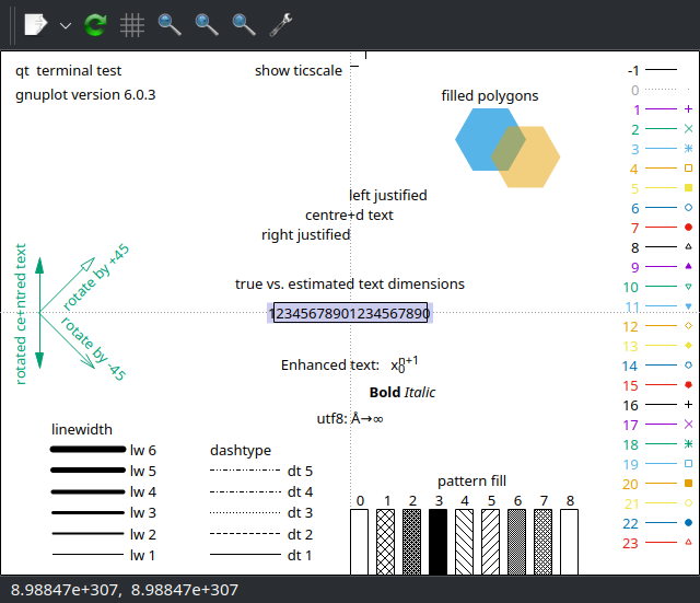
My default terminal when I start gnuplot is qt. If I
typed test at the gnuplot prompt, I would get the output
shown as a screenshot in Figure 5.
It may be exported interactively as an image, or PDF, or SVG file.
But there are other terminals in which the results of
test are piped, not to a graphics window, but to the
gnuplot terminal itself. In such cases, the outputs have to be
explicitly captured in named files through a set output
command in a format that is compatible with the chosen terminal
type.
Because the results of test vary with the selected
terminal—and since not all results may be interactively exported from a
window to some graphical format—I have written a trivial script below to
capture the results of test for several terminals that I
use. The output files then become a valuable lookup resource or cheat
sheet.
set terminal pngcairo
set output 'test-pngcairo.png'
test

set terminal pdfcairo
set output 'test-pdfcairo.pdf'
test

set terminal svg
set output 'test-svg.svg'
test
Compare Figure 5 with Figure 6 to better contrast the capabilities of
the qt and pdfcairo terminal types.
unset, set, and
show
It is obvious that unset undoes whatever
set has done, and restores the defaults. But, after a
terminal has been set, for example, how do we find out later the options
that are active? This is where the show is used.3 Try the following three lines on an
interactive gnuplot session to find out how this triplet of commands
works.
unset terminal
set terminal pdfcairo font "STIX Two Math, 20"
show terminal
Stack Overflow
The support ecosystem of gnuplot betrays its vintage. Newer software
like Typst features mutiple channels for quick resolution of
difficulties. But bear in mind also that Typst is in rapid development
while gnuplot is almost forty years old. Stack Overflow is one forum where
questions and answers tagged gnuplot are often very
helpful.
I recently encountered a difficulty with the title
setting. Accordingly, I asked a question
at Stack Overflow [3]. The reply by theozh
not only answered my question promptly, but also explained gnuplot’s
title settings over and above what I had sought as
clarification. From that answer I learned two important facts about
title in gnuplot:
There are three types of titles in gnuplot. These are:
the main title of the plot, usually placed outside the plot box;
the title above the keys or legend; and
the title or key to each item in the legend
The
plotcommand is the last in any script. Except forreplot, any other command, includingset title, that appears after theplotcommand in a script, does not get executed.
Simple but powerful ideas like these are vital but often unexplained clearly anywhere. Knowing them saves hours of perplexed head scratching and futile experimentation.
I can’t see my plot
After successfully executing code in interactive or batch mode, you
might see an image window fleetingly appear and disappear [4]. This is almost certainly due the
terminal not being invoked in persist mode. The command
show terminal at the gnuplot prompt should show the
terminal that is currently in use. It is very likely to be a
window-based graphic terminal. Let us say, for example, that it is a
qt terminal. If it appears and disappears, just key in
set terminal qt persist and your graphics should stay
visible.
If that is not the issue, check to see if the terminal type is
something like pdfcairo. In that case, unless you save your
output in a file, you will see a stream of characters—many of which are
unintelligible—representing a PDF stream, but no image. Either save and
view your output file, or change to a graphic terminal to better suit
your purpose.
Avoiding font hell
If you have ever tried to change the text font in Matplotlib, you will know the meaning of font hell. Even today, I do not know if it is at all possible to change the mathematics font used in Matplotlib.
When it came to gnuplot, I was more than a little apprehensive. I thought, “What if no fonts outside the standard 35 PostScript fonts built into PostScript printers were supported?” How wrong I was!
One of the strengths of gnuplot’s modular design is that changes can
be made nimbly and independently to keep up with technological
developments. Changing the options for one component does not upend the
whole apple cart. I have already alluded to the updated
terminal types as one example of this design benefit. I
found to my pleasant surprise that fonts could also be easily changed.
All one needed to do was to name the font correctly and follow it with a
size.
I will illustrate font use with an example from a code snippet that I have written, which is explained line by line below:
reset session
set encoding utf8
set terminal pdfcairo rounded size 8in,8in font "STIX Two Math, 20" enhanced
set output "/tmp/myfile.pdf"
The
reset sessioncommand pretty well restores settings to their native state. Settings liketerm,encoding,output, etc., are not reset, though. As always, when in doubt consulthelp resetat the gnuplot prompt.set encoding utf8allows Unicode characters to be used directly. For instance, Unicode character \(𝜃\) (U+1D703) is called Mathematical Italic Small Theta and differs from the regular Greek Unicode character θ (U+03B8) which is called Greek Small Letter Theta.The next line starting
set terminal pdfcairohas several options. Note that generally, for such settings, we must follow the documented parameter ordering. This order is shown when, for instance, we viewhelp pdfcairofor this particular terminal. In this case, however, the documented order does not appear to be mandatory.Note that options are not comma-separated, but space-separated instead. The option
size 8in,8inandsize 20cm,20cmwill both be accepted, butsize 200mm,200mmwill not be. Onlyinandcmare valid size units. Although the documentation stipulatessizeas the last parameter, in this case, we can get away with a different ordering. Also, note that ifsvgis selected, there are no units—just numbers—for the size.4The parameter
roundedis something gnuplot has in common with TikZ-PGF and Typst: it is a property of the line cap or line join.The option
font "STIX Two Math, 20"denotes the STIX Two Math font at size 20 points. Note the rare occurrence of a comma in an option parameter whose value is also in double quotes. While the keywordssizeandfontdenote what option is being invoked, there is no such keyword forrounded, such as a line cap or line join. I guess that such inconsistencies might be ironed out with a systematic and uniform key-value setup in future. But that may be just wishful thinking: gnuplot has a mind of its own!The last option
enhancedis a common property of terminals. It allows mathematical syntax, for example. It is also possible to selectnoenhancedto turn off this feature. And that is the end of our dissection of theset terminal pdfcairoline.The last line,
set output "/tmp/myfile.pdf"stores the resulting graphic output of the script in the filemyfile.pdfin the/tmpdirectory. I have used/tmpto underscore the point that the file may be anywhere on the system. Note the use of double quotes for the string variable carrying the file name. The extension of the saved file should match the terminal type.
As previously alluded to, if the output of terminals like
pdfcairo and svg is not saved into a file, the
resulting graphics is simply piped to the terminal as a character
stream, and you will see a lot of mostly unintelligible characters
instead of a coherent picture.
Mathematics without LaTeX
Because TeX/LaTeX was the first dedicated mathematical typesetting system, the inclusion of mathematical expressions and fonts were often outsourced to LaTeX by the plotting programs of yesteryear. After the emergence of Typst, mathematical fonts, typesetting, and graphics were available without recourse to LaTeX. With this in mind, I wanted to find out whether gnuplot alone could produce graphs with proper mathematical annotation, without intervention from LaTeX, Typst, or any other external software.
I will illustrate this aspect with a graph of the Lemniscate of Bernoulli, which has the polar equation \(r^{2}=a^{2}\cos {2\theta }\). I wanted to include the polar equation in the title of the graph. My script to draw it is shown below:
reset
set encoding utf8
set terminal pdfcairo size 20in,8in font "STIX Two Math, 24" enhanced
set output "lemniscate-of-bernoulli.pdf" # PDF output

set grid linetype 0 linecolor "gray80"
set border linewidth 0.5
set samples 1000
set parametric

set title "Lemniscate of Bernoulli: r^2 = a^2 cos 2θ" # title
a = 1
x(t) = a*cos(t)/(1 + sin(t)**2)
y(t) = (a*sin(t)*cos(t))/(1 + sin(t)**2)
plot x(t), y(t) lw 5 title sprintf("a = %1.1f", a)
replot
I think you would appreciate from above how the crisp, minimal, and
mostly self-explanatory commands of gnuplot work. Its deep roots in C
should also be evident. We plot a curve and save it as a
PDF. Gnuplot has enough integrated libraries to generate most
mathematical functions by itself, which is a tremendous
advantage. Indeed, many newer plotting programs lack sufficient
mathematical and computational heft to generate their own table of
values. They usually rely on gnuplot to output tables of data
that they then happily set out to plot afterward.
In this graph, we have transitioned to a parametric description of the curve, which gnuplot accepts, with the default variable \(t\).
The purpose of this example is to illustrate the mathematical
typography in the title and the legend key, as displayed in Figure 7 and Figure 8 below. The latter image was obtained by
replacing the line with the terminal comment # title above,
with the one below:
set title "Lemniscate of Bernoulli: 𝑟^2 = 𝑎^2cos(2𝜃)" # titleNote in particular, how the characters in the equation have been changed, even though their human-readable meaning has not been altered.


If you cannot detect the difference between these two images, I have extracted below the two titles: one without mathematical fonts, in Figure 9, and the other with mathematical fonts, in Figure 10.
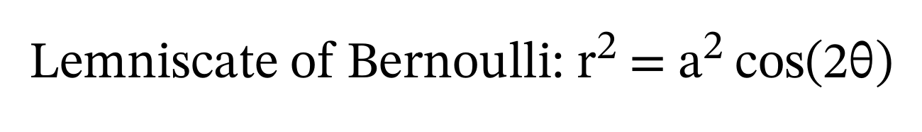
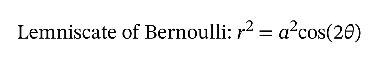
Because Figure 10 was generated without
using LaTeX—simply by using the utf8 encoding and the
mathematical Unicode code points in the STIX Two Math font, we may now
claim that gnuplot can produce standalone graphics incorporating
mathematical symbols.
The mathematical letters are part of a Unicode Block “Mathematical Alphanumeric Symbols” starting with U+1D400 and ending with U+1D7FF. Any desired letters may be copied and pasted from this block into the source text using a mathematically-aware font like STIX Two Math.
Multiple plots on the same axes
If you did not know about replot you would be dismayed
to learn that gnuplot overwrites every last plot with the next one. It
took me awhile to understand this. For example if you had plotted
sin(x) and wanted to superimpose or overlay the graph of
cos(x) on it, you could write:
plot sin(x)
replot cos(x)
Another way to do this is to use a comma, a space, and the line
continuation character, which is a backslash, \ so:
plot sin(x), \
cos(x)
Note that the syntax is , \, i.e., a comma, a space and
a backslash, followed by a newline. There should be no character after
\—especially a hard-to-discern space—on the previous line.
These line continuation methods work interactively, and from within
scripts.
Colors in full glory
Gnuplot has access to a wide variety of colors and methods to access
them: from RGB triples to named colors. Those who like the CSS-SVG named
colors will be disappointed to find that the named colors in gnuplot are
from an earlier version of the X11 colors rather than the newer,
standardized set of 147 colors. An example of color cycling from within
a for loop is explained in the next section.
The Joy of iteration
Gnuplot allows for loops to be succinctly included from
within the plot command itself. I wanted to plot a family
of catenaries using gnuplot, to see how they compared to those I got
from Typst. This required varying the parameter \(a\) in the definition of the catenary \(a \cosh\left(\frac{x}{a}\right)\).
It was relatively easy to generate the family of catenaries. What was
not so simple was to successfully assign chosen colors to each catenary
to distinguish it from the others. I used named colors and thought I
could access them directly, but that is not possible at present, even
with the latest version of gnuplot that I am using:
Version 6.0 patchlevel 3. But there is a non-tedious
workaround that functions splendidly, as explained after the script:
#
# PDF output
#
reset
set encoding utf8
set terminal pdfcairo font "STIX Two Math, 22" rounded size 20cm,20cm
set output "catenary-family.pdf" # PDF
#
# Initialize
#
set size square # aspect ratio of 1:1
set grid linetype 0 linewidth 1 dashtype 3 linecolor "grey50" # dotted
set border linewidth 0.5
set samples 1000
set xrange [-4:4]

array A[6]
A[1] = 0.9
A[2] = 1.0
A[3] = 1.3
A[4] = 2.0
A[5] = 2.4
A[6] = 3.2

array named_color[6]
named_color[1] = 'orangered4'
named_color[2] = 'dark-cyan'
named_color[3] = 'coral'
named_color[4] = 'steelblue'
named_color[5] = 'dark-olivegreen'
named_color[6] = 'dark-violet'

set key at screen 0.5, screen 0.6 center # legend position using screen units
set title "Family of catenaries: 𝑎 cosh(𝑥/𝑎)" offset 0, -8 font ", 26" \
enhanced
plot for [i = 1:6:1] A[i] * cosh(x/A[i]) linecolor rgbcolor(named_color[i]) \
linewidth 3 title sprintf("𝑎 = %1.1f", A[i])
We are using arrays in gnuplot for the first time. An array
A with six elements furnishes the values for the variable
\(a\) for the family of six catenaries.
These values are instantiated from within the plot command via a
for loop. That part of the script worked exactly according
to plan.
But I also wanted each curve in the family of six to have a different
color. Originally, I had tried accessing the colors via another
six-element array called named_color[i] but it did not
work. It turns out that I needed to wrap the array element
named_color[i] with another function called
rgbcolor(). After that, the script worked.5
The title and key in the final figure were
positioned to mimic the positions of the result I got from Typst. The
gnuplot output is shown in Figure 11
below and should be compared to Figure
3 of my blog e Unleashed. In my opinion, gnuplot is not
wanting in any regard.

Straight lines
Straight lines are the easiest graphs to plot by hand, and it is reasonable to expect that plotting straight lines should not strain the powers of a plotting program either, especially one as powerful as gnuplot. But can gnuplot draw a straight line with minimal fuss?
Most resoundingly, yes! With Cartesian coordinates, and a known equation, like \(y = mx + c\), it should be a cinch. Here is a demonstration script that you may download, modify, and experiment with.6 It generates graphs of several straight lines. These lines pose no problems to gnuplot.
Vertical straight lines
The horizontal line \(y = 2\) in the demonstration script may be plotted without fanfare. But what about the vertical line \(x = -4\)? Being vertical and straight, its gradient is not defined—or infinite in magnitude if you will—and there is no way gnuplot will treat it the same way as a garden variety straight line like \(y = mx + c\). So, how does one plot a vertical straight line? We consider several solutions below.
Parametric equation
One may use parametric equations to plot \(x = -4\) so:
set terminal qt persist
set parametric
set trange [-10:10]
set xrange [-10:10]
plot -4, t linewidth 3 linecolor "gray50" title "x = -4" # Note minus sign −
The default variable for parametric plots is \(t\). Since \(x =
-4\), the first of the paired x, y inputs is simply
\(-4\), and the second is \(t\) which stands for \(y\), and is allowed to vary within the
stipulated range for \(t\). Using
parametric descriptions is a very powerful way to surmount logical
barriers when defining functions. It allows us to circumvent the
conceptual brick wall of how to express \(y\) in an equation where it can take any
value, while \(x\) is but a single,
constant value, \(-4\). Note the
standard key/legend entry, title "x = -4".
Input from a data file
Gnuplot can plot a graph from data arranged in columns in a text file. Indeed that was how I recall it was used back in the 1990s. One can define the independent variable and the dependent variable by the column numbers they occupy in the data file. One can then pass \(x, y\) pairs to gnuplot and get it to plot a graph. For the case of the vertical straight line \(x = -4\), we could proceed as follows:
set terminal qt persist
set xrange [-10:10]
set yrange [-10:10]
# Print data to file
set print "/tmp/x-equals-four.dat"
print -4, -10 # or print "-4 -10"
print -4, 10 # or print "-4 10"
unset print
#
plot "/tmp/x-equals-four.dat" with lines linewidth 3 linecolor "gray50" \
    title "x = −4"
For those who are curious about how the data file looks like it, here it is:
-4 -10
-4 10
Because gnuplot can handle a wide variety of data, the style of the
plot must be clearly defined. Take a look at help with for
the dazzling array of options. In our case we are after the humble line
and we get it exactly as desired with the above script. Note that the
input data may be specified in two ways.
Input from a data block
There is a data construct called a here document in
bash in Linux, where data to a script might be provided
within the script itself. The equivalent in gnuplot is the data
block. The previous example depended on a data file in the
/tmp directory. But sometimes, this may not be desirable.
In such cases, it will be ideal if the data could be piped from within
the script itself, as with the data block, illustrated below:
set terminal qt persist
set xrange [-10:10]
set yrange [-10:10]
$vertical << EOD
-4 -10
-4 10
EOD
plot $vertical with lines linewidth 3 linecolor "gray50" title "x = 4"
Headless arrow
There is a fourth method of getting a vertical line from gnuplot, but it involves an abuse of the intended function. We use a headless arrow. Here is the relevant code for our vertical line example:
set terminal qt persist
set xrange [-10:10]
set yrange [-10:10]
set arrow from -4, -10 to -4, 10 nohead linewidth 3 linecolor "gray50"
plot NaN linewidth 3 linecolor "gray50" title "x = 4"
Note the use of NaN for the plot data. This allows use
of the plot function with null output [5,6]. We need something exactly like this
to access the key/legend title, but cannot do so legitimately as we have
arrows instead of a graph as our “plot”. It is a neat trick.
Consolidated straight line plot
We are now ready to integrate the plotting of a vertical straight line with other straight lines to conclusively demonstrate the power of gnuplot in handling all manner of straight lines.
The script used to plot the lines is called
straight-lines.gp and may be downloaded from here.
The resulting plot is shown in Figure 12.

Minus − versus Hyphen -
The sharp-eyed among you would have noticed that the \(x = -4\) legend key had a better looking minus sign than the anaemic ones for the other lines. The reason is font-related. The programmatically generated legend keys embody hyphens as minus signs, whereas, the hand-crafted key for \(x = −4\) has a Unicode minus sign (U+2212), which is longer than the hyphen. I could have prettified all the minus signs in the legend, but that would have involved conditional statements, etc., which I thought was straying too far afield for this blog.
On investigating further, I found that the issue of a mathematical
minus sign in Unicode had been raised many years ago [7]. The solution, to use
set minussign, necessitates the use of the
gprintf specifier—unique to gnuplot—which “accepts only a
single variable to be formatted.” I am optimistic that we will see a
clean fix in later revisions to gnuplot.
Freeth’s Nephroid
Gnuplot is perfectly capable of setting up a polar coordinate grid and plotting a curve using its \((r, \theta)\) definition. Here, I have chosen Freeth’s Nephroid for its unusual name and shape.
Do download the
script for Freeth’s Nephroid and experiment with it. Because the
standard setup is Cartesian, it is preferable to unset grid
and unset border to remove the standard Cartesian axes and
box, before invoking polar coordinates with set grid polar
and set border polar. The resulting curve is shown in
Figure 13.

Polar-Parametric Waltz
The final example I want to discuss is the plotting of a curve that resembles a halved onion. It is called Fermat’s Spiral. Its equation is simple and beautiful: \[ r^2 = a^2\theta. \] I want to overlay on this curve the line \(y = x\) in Cartesian form, simply to find out if it can be done easily. I have since found that accomplishing this successfully requires navigating several shoals.
Straight line in polar coordinates
When plotting a straight line in polar coordinates, the line \(y = x\) becomes the line \(\theta = \frac{\pi}{4}\). Gnuplot’s input requires polar inputs to be given in the form \(\theta, r\). While \(\theta\) is fixed at \(\frac{\pi}{4}\), \(r\) can range freely. So, what equation do we provide for \(r\)?
Parametric and Polar
Parametric equations can be enlisted to the rescue. Parametric and polar settings may be used together in gnuplot. But there is an important bump to cross. The parameter, and the polar angle, \(\theta\) both share the same symbol, \(t\).
To appreciate the dramatic difference that the Cartesian or polar interpretation makes in gnuplot, try executing the script below:
reset
set encoding utf8
set terminal pdfcairo font "STIX Two Math, 24" enhanced size 20cm,20cm
set output "../images/circle.pdf"
#
set size ratio -1 # isotropic
set grid linetype 0 linewidth 1 dashtype 3 linecolor "grey10" # dotted
set key Left reverse right samplen 3 font ", 18"
set key offset screen -0.2, screen -0.1
#
set parametric
set title "Parametric plot of a circle in Cartesian co-ordinates"
plot cos(t), sin(t) lc "dark-violet" lw 3 \
  title "cos^2 𝜃 + sin^2 𝜃 = 1"
set output "../images/circle-plus-figure-of-eight.pdf"
#
set polar
unset rtics
set title "Circle and Lemniscate-like Figure-of-Eight \
    Curve in Polar Corodinates"
plot cos(t), sin(t) lc "dark-orange" lw 3 \
  title "lemniscate: 𝑟^2 + 𝜃^2 = 1", \
  t, 1 lc "dark-violet" lw 3 title "circle: 𝑟 = 1"
#
reset
Two figures are output by this script:
Figure 14 results from the parametrization \(\cos t, \sin t\) with Cartesian coordinates. The two variables are interpreted as \(x = \cos t\) and \(y = \sin t\), in that order and the resulting curve, \(x^2 + y^2 = 1\), is a circle.
Figure 15 is what pops out when we change the interpretation from Cartesian to polar. The curve traced out by the parametrization \(\cos t, \sin t\) is a figure-of-eight on its side. Note that the variables have not changed, but their interpretation is vastly different now. The ordering in gnuplot is not \(r, \theta\), but confusingly, \(\theta, r\). The new interpretation gives us \(\theta^2 + r^2 = 1\),7 and the curve is a figure-of-eight on its side. For comparison, the circle is now defined by \(r = 1\), which is parametrized as \(t, 1\) in the second curve in the polar plot. The
set polarhas re-defined the equation of the circle.


The moral of these two examples is that with and without the magic
words set polar, the same parameters can give us vastly
different results. This arises from the interpretation of \(t\) as our sole parameter in one case, and
angle \(\theta\) in another.
A straight line through the pole or origin
How do we deal with the line \(y = x\)? The slope is \(1\) and the angle made by this line with the positive \(x\)-axis is \(\frac{\pi}{4}\). So, the first polar parameter \(t\) may be set to \(\frac{\pi}{4}\). But \(r\) can take on any value.
In 2D plots, we have only one independent variable, and one dependent variable. The angle, \(\frac{\pi}{4}\), being fixed, does not depend on anything else. So, how does \(r\) vary? It can take on any radial value, continuously. How do we indicate it? By the parameter \(t\)? But is that not the angle \(\theta\)? But \(t\) is the only variable we have.
The symbol \(t\) is overloaded with two meanings. Yet in a 2D parametric plot, the single independent variable is \(t\). In a polar plot, the first variable position is taken by the angle and the second by the radius. So, the first variable is \(\frac{\pi}{4}\). What about the \(r\) value? We let it range freely and assign it to parameter \(t\). So, to plot the straight line at 45° to the positive \(x\)-axis, we have
plot pi/4, tand it is as simple as that. We are not writing the equation \(r = \theta\) here. This is a concealed pothole we must beware because of entrenched habits of thinking. But once crossed, we have an elegant solution to the simple problem of how to plot a straight line, especially passing through the origin, on a polar plot.
Square Roots and Branches
The equation for Fermat’s spiral, \(r^2 = a^2\theta\), resembles that of a parabola in Cartesian coordinates: \(y^2 = ax\). Let us consider the familiar parabola first. First we make \(y\) the subject of the formula. We have \(y = \sqrt{ax}\). But the square of a negative real number equals the square of its positive counterpart. So, to be entirely correct, we need to write \(y = \pm\sqrt{ax}\).8

In like fashion, by making \(r\) the subject of the formula, we have \[ \begin{aligned} r &=\pm\sqrt{a^2\theta}\\ &= \pm a \sqrt{\theta}. \end{aligned} \] The variable \(r\) is constrained to take on both positive and negative values, despite being on a polar plot for which \(r \ge 0\) by convention.
There are two branches: one corresponds to the positive square root, and is called branch 1 whereas the other applies to the negative square root, and is called branch 2. gnuplot treats these two cases as two different plots and the curves are assigned different colors and legend keys to emphasize this fact.
The snippet of code that shows the definitions of the spiral and the straight line is shown below:
set polar
set parametric
#
a = 6
k = pi/4
#
plot [t=0:40] k, t linewidth 3 linecolor "forest-green" \
        title "𝜃 = 𝜋/4", \
     [t=0:40] k + pi, t linewidth 3 linecolor "royalblue" \
        title "𝜃 = 𝜋/4 + 𝜋 (reverse)", \
     [t=0:12] t, a * sqrt(t) linewidth 3 linecolor "dark-gray" \
        title " 𝑟² = 𝑎²𝜃 (branch 1)", \
     [t=0:12] t, -a * sqrt(t) linewidth 3 linecolor "dark-goldenrod" \
        title "𝑟² = 𝑎²𝜃 (branch 2)"
Both the straight line and the spiral are plotted as two branches. The case of the spiral has been explained above. But why is the straight line plotted twice? One is a ray from the origin directed outwards from the first quadrant. The other is a ray directed from the origin outward in the direction of \(\frac{5\pi}{4}\). The script for this curve may be downloaded here.
Can the polar r be negative?
In the polar representation, \(r\) is always positive and it is only \(\theta\) that changes sign. So, we set the angle to be \(225°\) or \(\pi + \frac{\pi}{4} = \frac{5\pi}{4}\), and allow \(r\) to range positively again. One of the great advantages of gnuplot is that we may specify the parameter range of each plot separately, as is done in the code snippet above.
There is an inherent inconsistency in how \(r\) is allowed to be negative for the spiral and not negative for the straight line despite both being different branches of the same spiral or straight line. Perhaps we have bent gnuplot so much to give us the curves we want that it has become mathematically inconsistent.
In the context of polar plots, there is no consensus on whether \(r\) should be non-negative or not even in an open mathematical forum.
Distraction removal
unset rtics # remove tics on 𝜃 = 0 lineThe above single line of code is used to remove the tic marks on the positive \(x\) axis so that they are not a distraction on a polar plot. With this comment, we conclude our final example on using gnuplot.
Closing thoughts
How does gnuplot compare with the other free, open-source plotting programs available nowadays? I think gnuplot offers unmatched power. There are often many ways to accomplish a given end, as I have illustrated in this blog. Tongue-in-cheek, I would venture that “nothing is really impossible with gnuplot; only inconvenient at times.”
Gnuplot is also mature enough to offer different line styles for plots: something that is not a standard feature in some newer plotting programs.
Because gnuplot is command-line interactive, it allows for the most rapid exploration and prototyping. In this it is probably unrivalled among the programs I have experience with.
In the recent past, however painful it was, I had adopted a solution using TikZ-PGF, or Matplotlib, or Typst, without giving gnuplot any thought. Now I would venture first with gnuplot, not least because of its interactivity. Its syntax is uncluttered and unentangled. Ideas may be easily tested interactively. Changes may be made and checked rapidly, to allow for a faster solution, without compromising on the quality of the output.
Yes, gnuplot has come a long way. It is still recognizable. Just as powerful as before, if not more. But it has far more sheen than when I last met it. Power and Beauty have met at last!
Additional online resources
There are some quality sites dedicated to matters gnuplot. I have listed below a few that I have come across.
AI agents like ChatGPT, Gemini, and Claude were helpful with “quick and dirty” answers that were sometimes incorrect. Experience is needed to frame unambiguous questions, as well as probe and troubleshoot flaky answers.
The Centre for Computational and Theoretical Molecular Science (CTCMS) at the University of Queensland has a tutorial devoted to plotting data using gnuplot [8] that is well-written and authoritative. Since we have not even sampled gnuplot’s data visualization capabilities here, take a look if your use case is data display.
The
NaNtrick to produce a null plot is explained in the earlier version of the Gnuplot Tricks website [5]. Its successor has migrated here [6].A dated gnuplot Quick Reference in PDF form [9] is still online and may assist the newcomer to gnuplot to attain some proficiency quickly.
An interesting site named Gnuplot Tips is now maintained by Nikos Karampatziakis who claims he has “resurrected Toshihiko Kawano’s awesome gnuplot website.” Check it out to get a firmer footing in gnuplot.
Another online tutorial, although quite dated, is at the MathBlog website [10] in which the plotting of both functions and data is covered.
Acknowledgements
To the authors of all the resources cited in this blog, my grateful thanks. Above all to the contributors and maintainers of gnuplot, my deepest appreciation for keeping the flame alive across four decades, with improvements to proudly match the zeitgeist.
Feedback
Please email me your comments and corrections.
A PDF version of this article is available for download here:
References
After this one instance, I will use normal rather than
monospacefont to refer to gnuplot. Except at the start of a sentence, I shall adhere to accepted usage and address the software as gnuplot, with a lowercase g.↩︎help outputis typed at the interactive prompt shown bygnuplot>sognuplot> help output. Thegnuplot>prompt is omitted henceforth, but should be understood in all the examples that follow from here on.↩︎The commands
setandshoware also used for a related function in Typst.↩︎I have not found the
svgterminal to be trouble-free and distortion-free, because the terminal size is unitless. So, I have resorted to using thepdfcairoterminal and using a PDF to SVG converter externally to obtain SVG versions of figures.↩︎To use the array
named_color, I enlisted the help of three AIs, two of which said it could not be done, and one of which gave me the working solution. It pays to try again and again. Do not blindly believe the response from an AI!↩︎Some scripts have been localized to send the outputs to files where a path has been prepended to a filename. Feel free to modify these filenames to suit your local setup.↩︎
The curve, \(\theta^2 + r^2 = 1\), is a mathematical oxymoron because \(\theta\) is dimensionless and \(r\) has units of length. Adding their squares does not make dimensional sense. Yet, it is plottable, and holds a lesson of caution when we enter a
parametricpluspolarsetup. One could always prefix a parameter \(a\) of dimension length to \(\theta\) to rectify the situation, and set \(a = 1\).↩︎Recall that \(y = x^2\) is a function, but \(y^2 =x\) is not, due to the implicit assumption that \(x\) is the independent variable, and \(y\) the dependent variable.↩︎